Kyle Davila / Creative Director & Designer
ToggleAmerican HeartAssociation
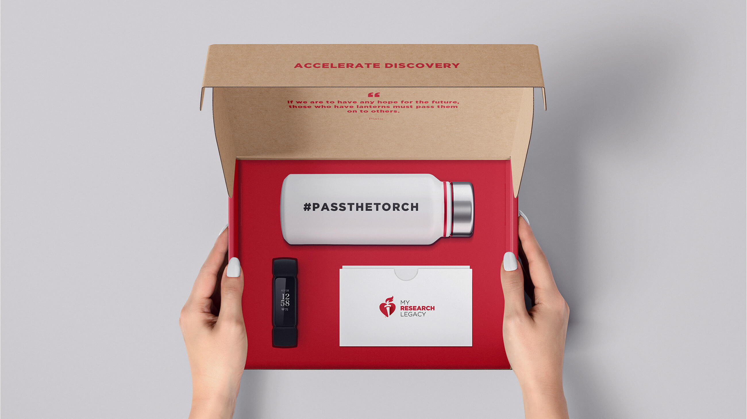
Art Direction / Packaging / UI/UX
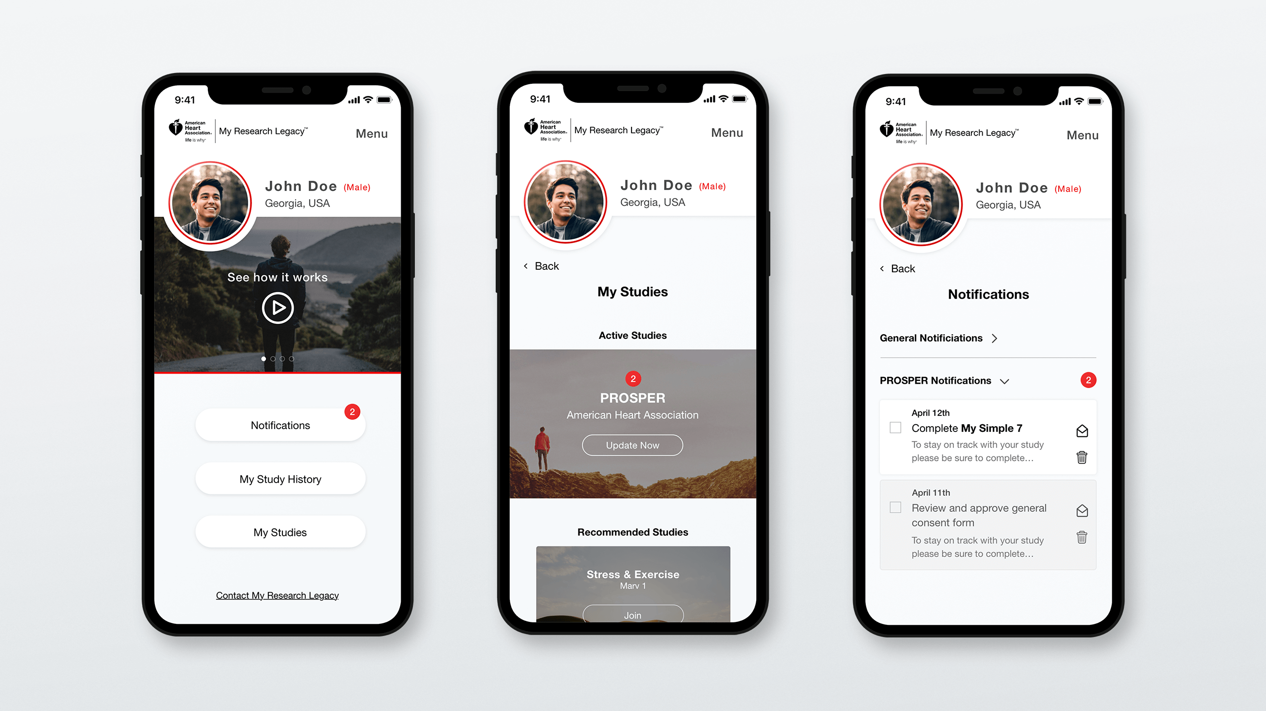
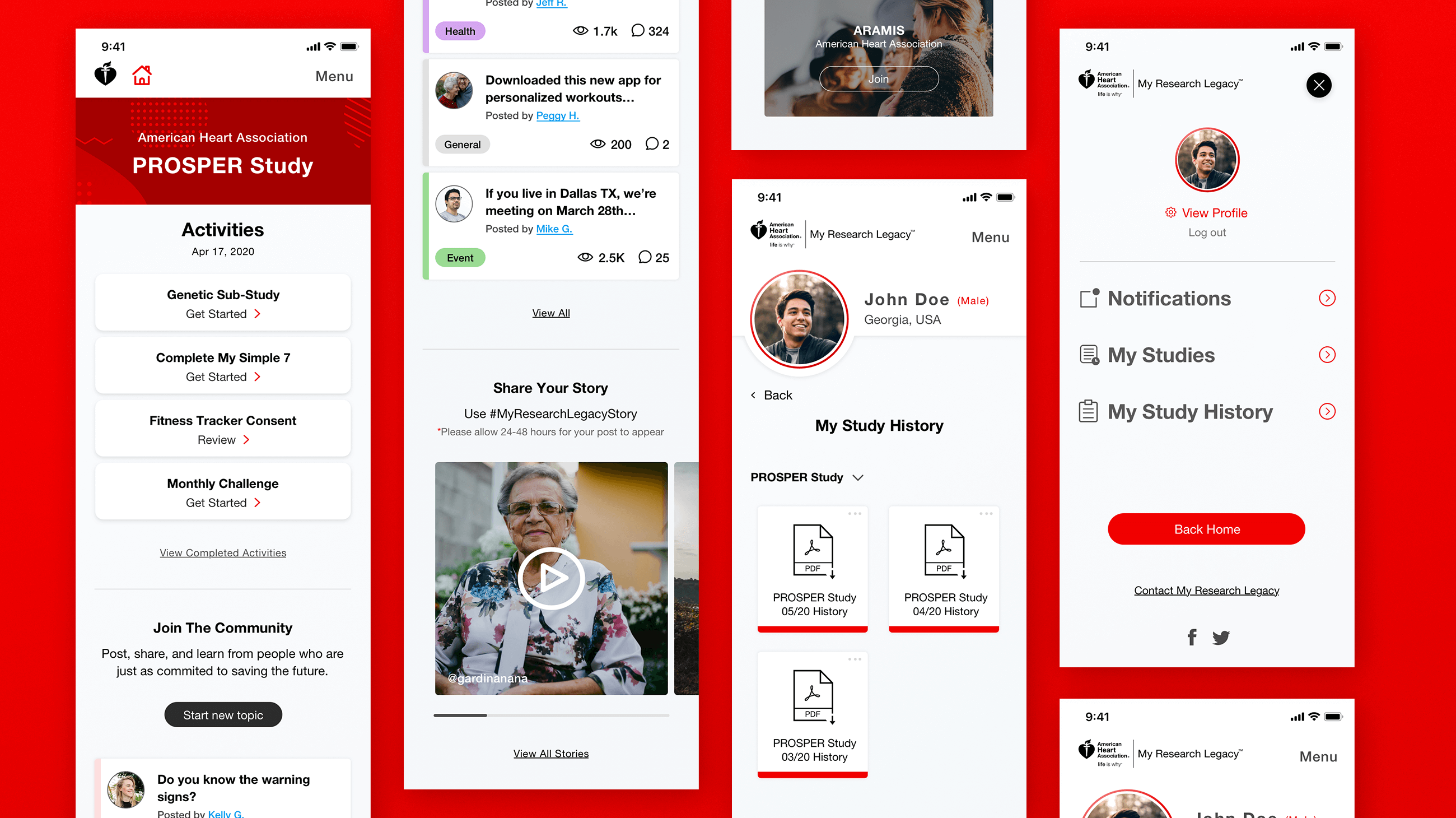
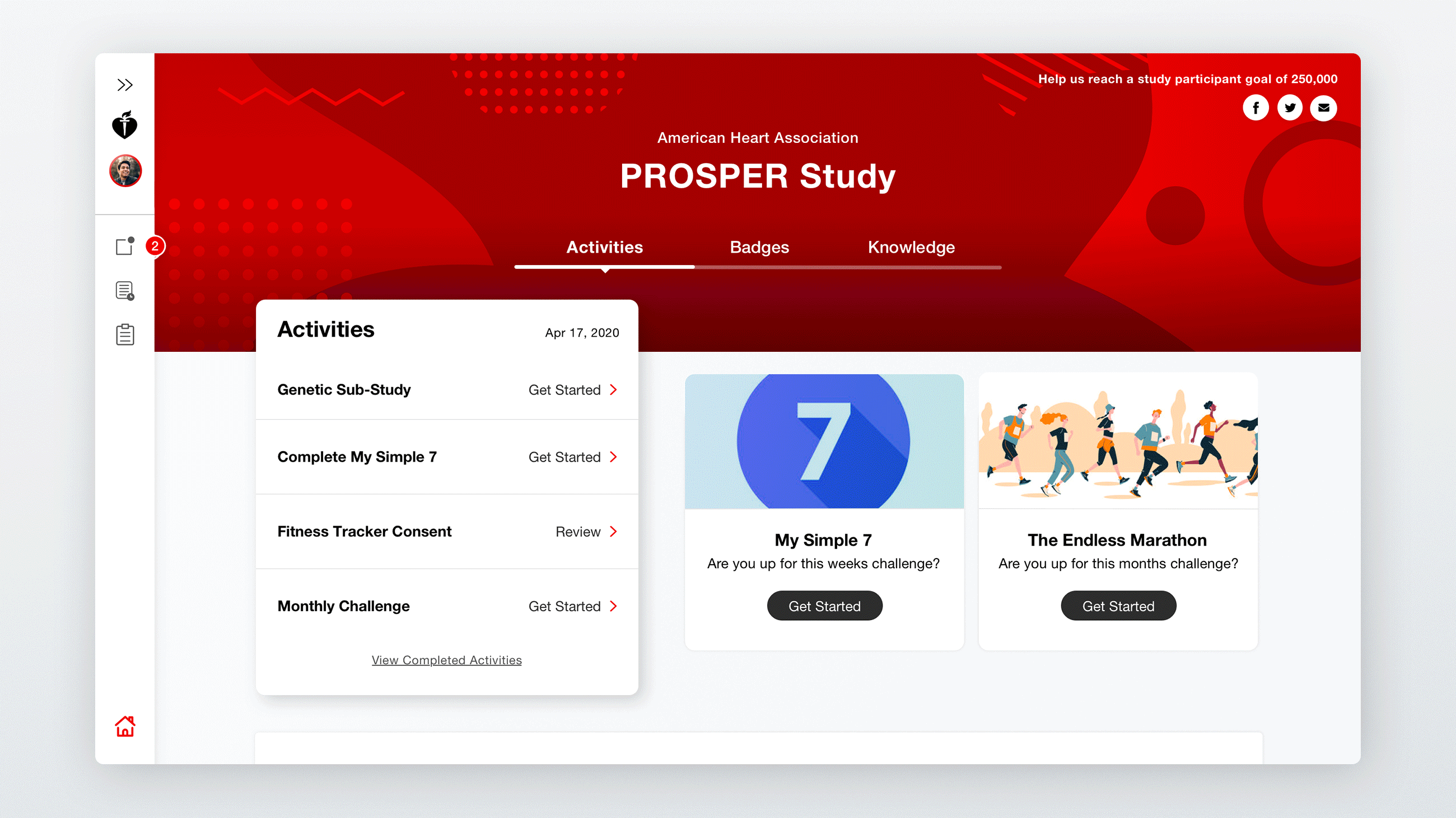
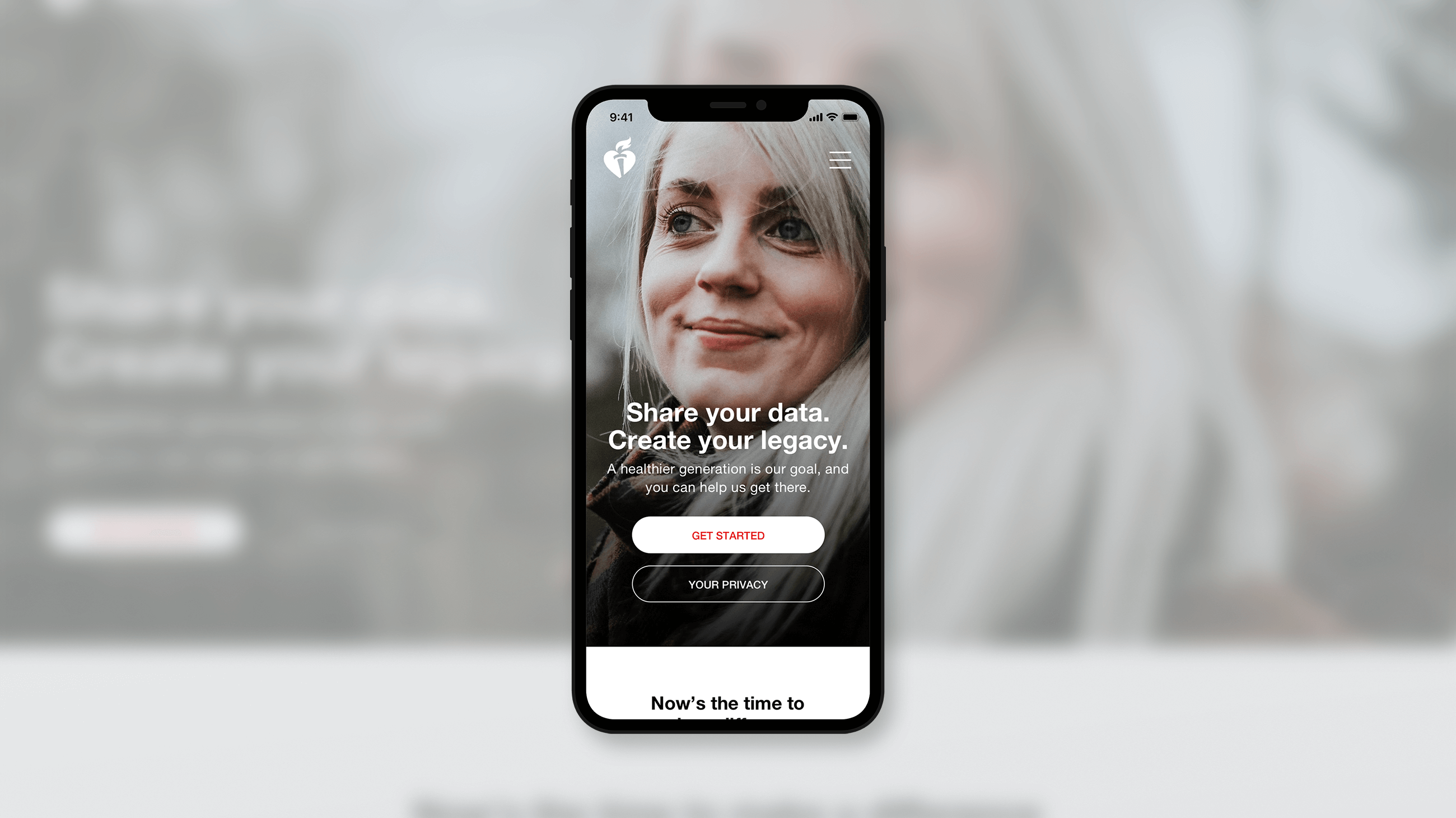
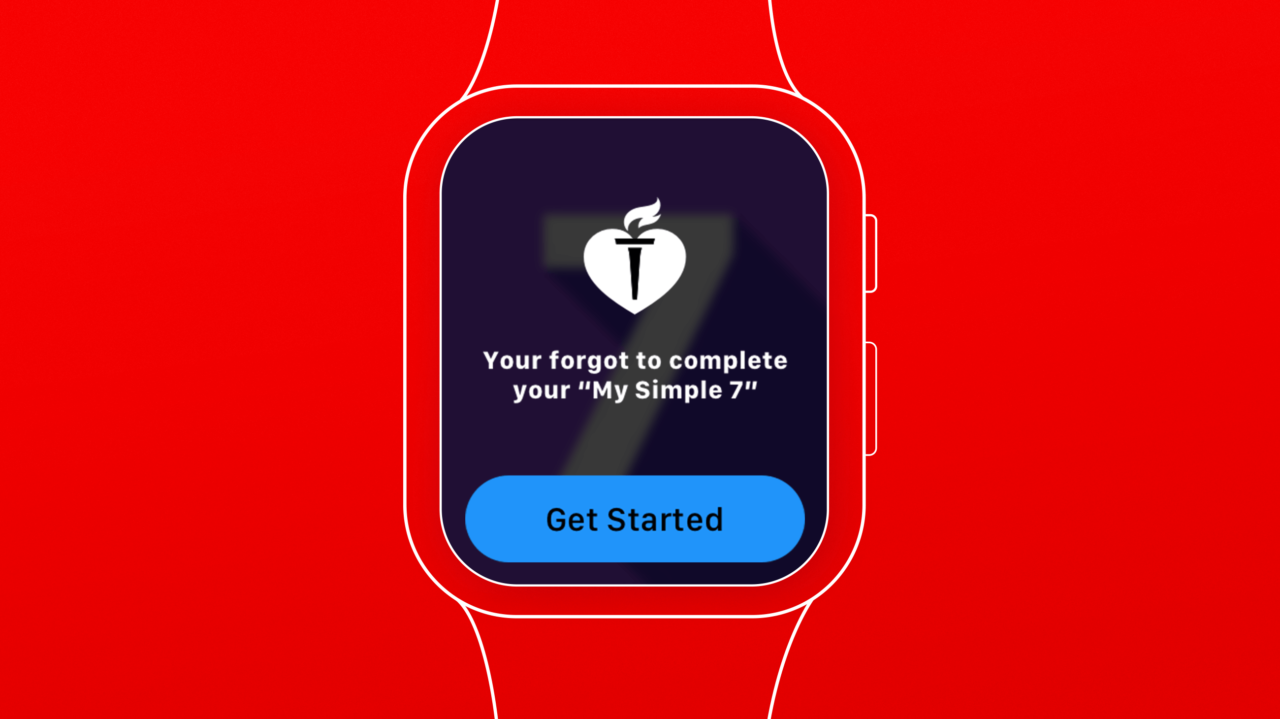
With a big initative for AHA being engagement in the study, we made the mobile experience 100% task driven. These days, everyone is on the go, with a mobile device in hand. Accessing the dashboard on a mobile device offered less distracting options, allowing participants to get on, contribute and get on with their day within a matter of minutes. Fewer taps means less stress.
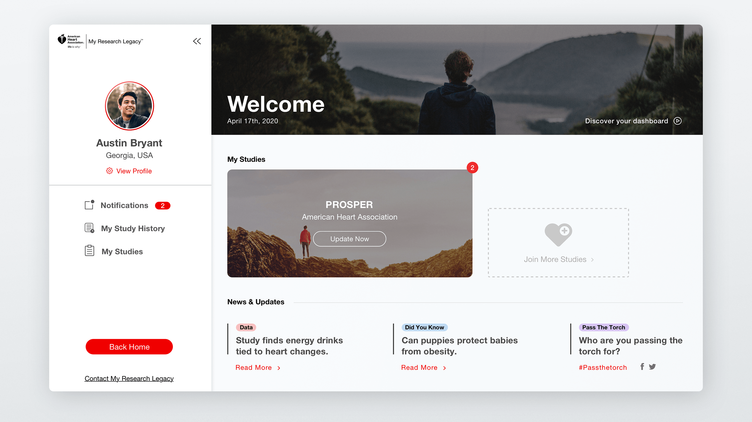
Knowing our demographic would skew slightly higher, we focused on creating a dashboard that kept the user oriented at all times. Before working with us, AHA noticed many participants were failing to complete their tasks associated with the study. An audit of their ux revealed a flaw in easily identifying to the user what tasks needed to be completed. We placed emphasis on designing a notification system that made new/urgent tasks more prominent to encourage participants to complete them. The primary goal of the dashboard was to make participating easy.