Kyle Davila / Creative Director & Designer
ToggleHarvest Snaps
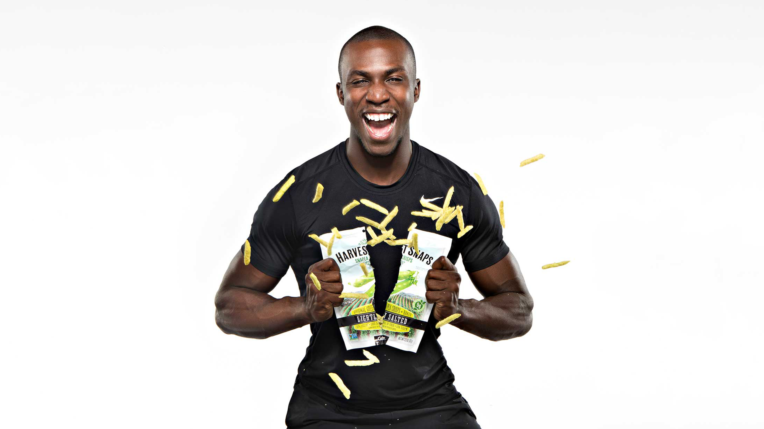
Art Direction / Branding / Campaign / Packaging
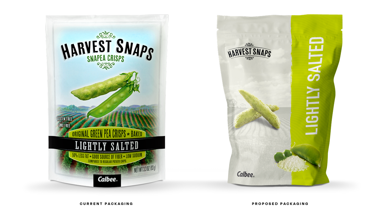
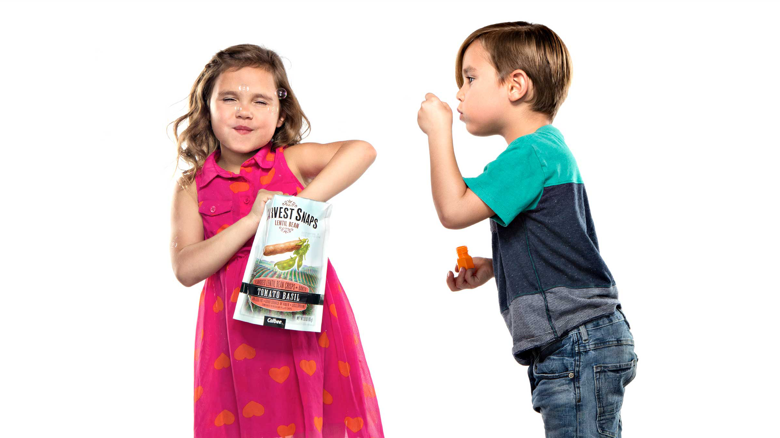
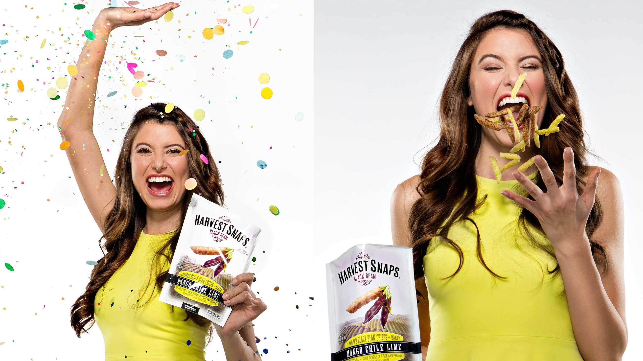
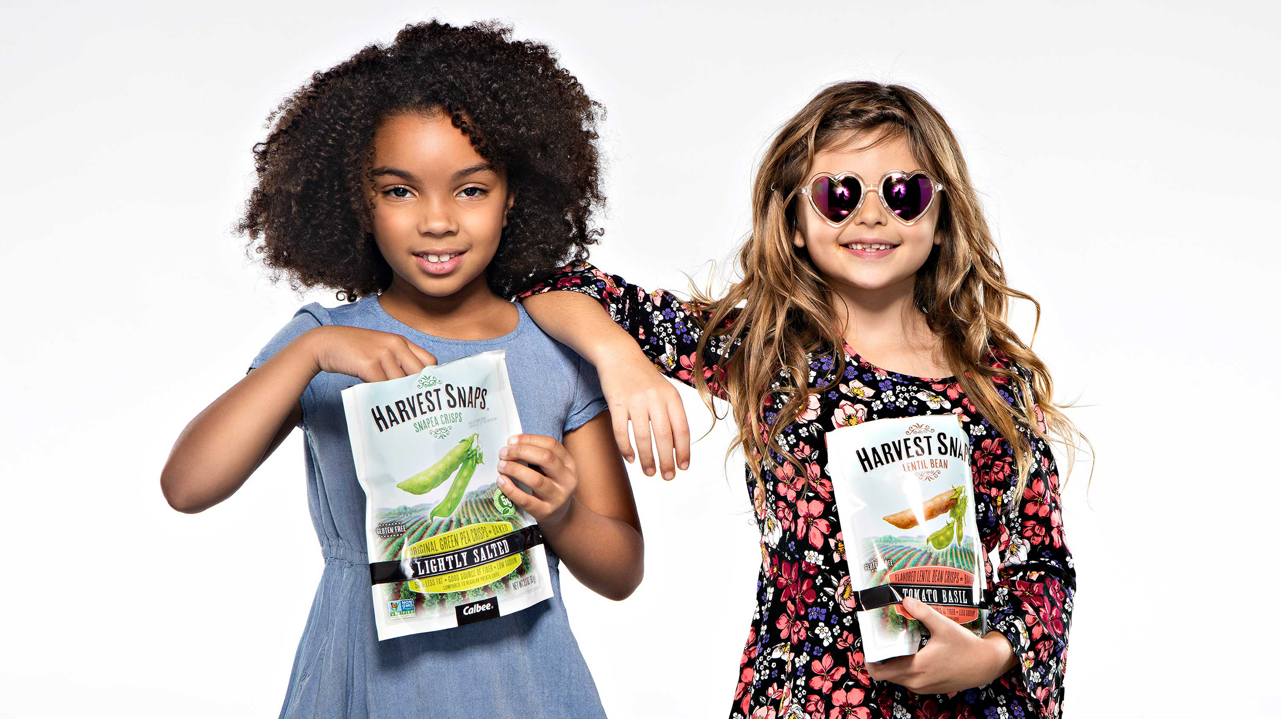
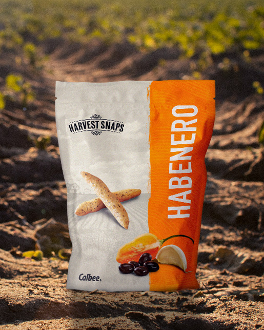
As an added bonus, we proposed new packaging that represented that "good for you" feeling associated with the snack.
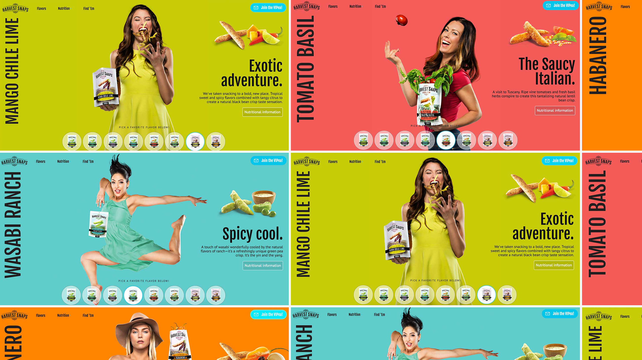
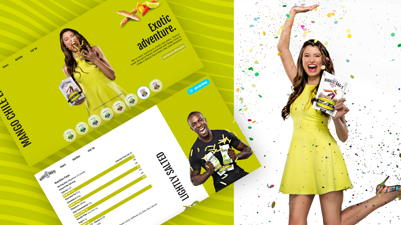
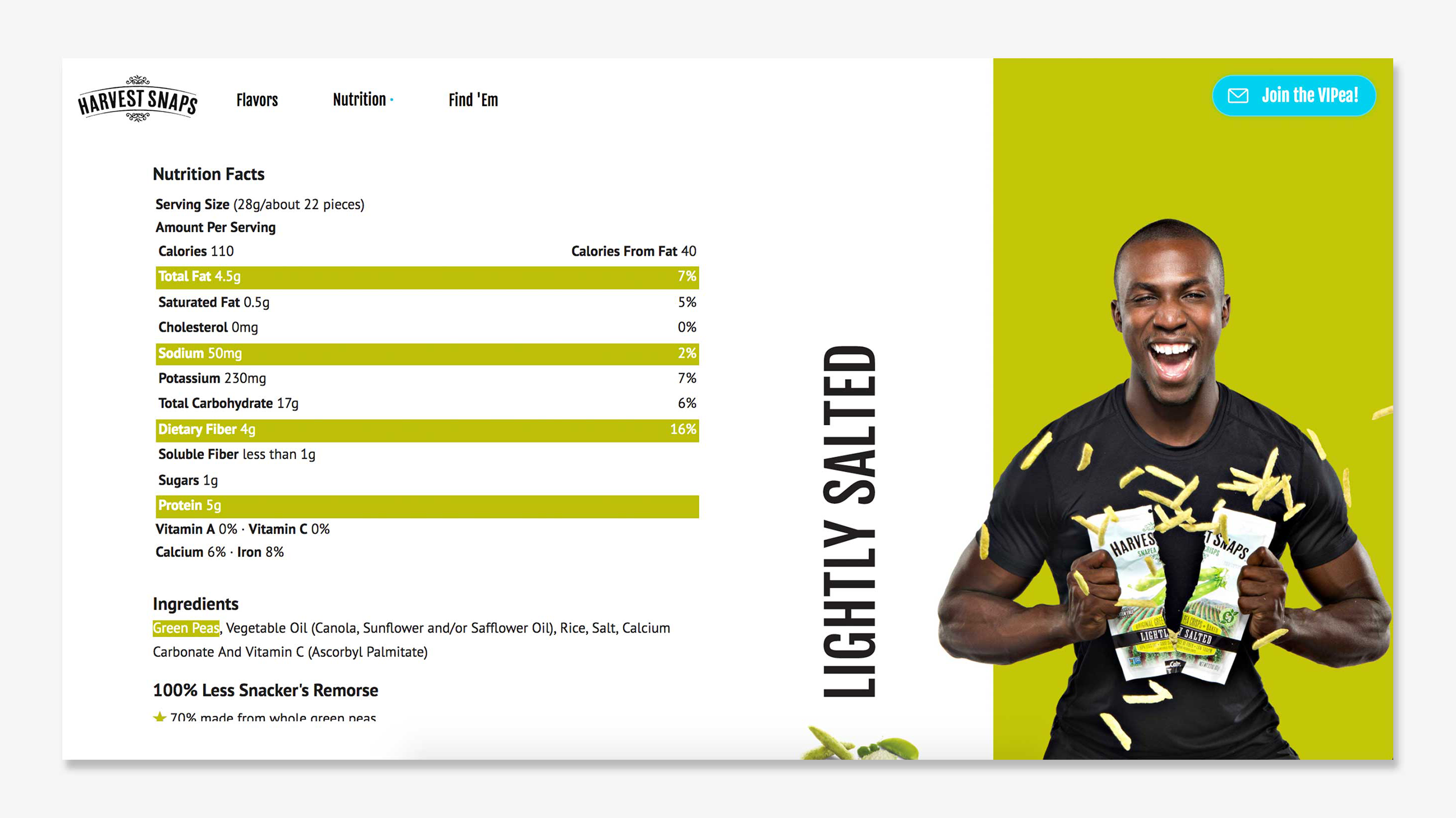
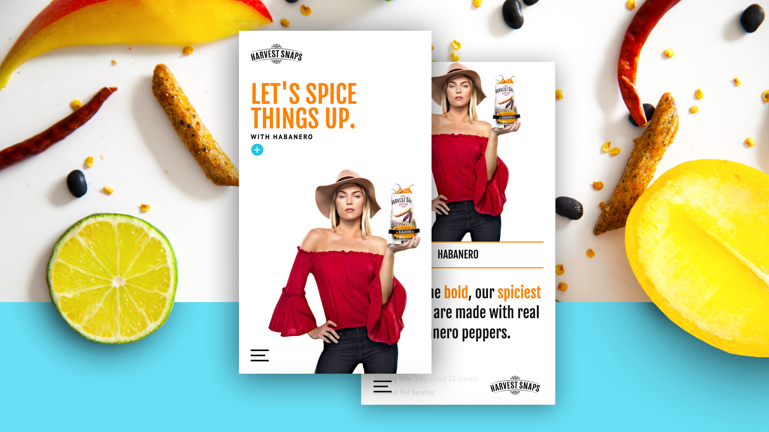
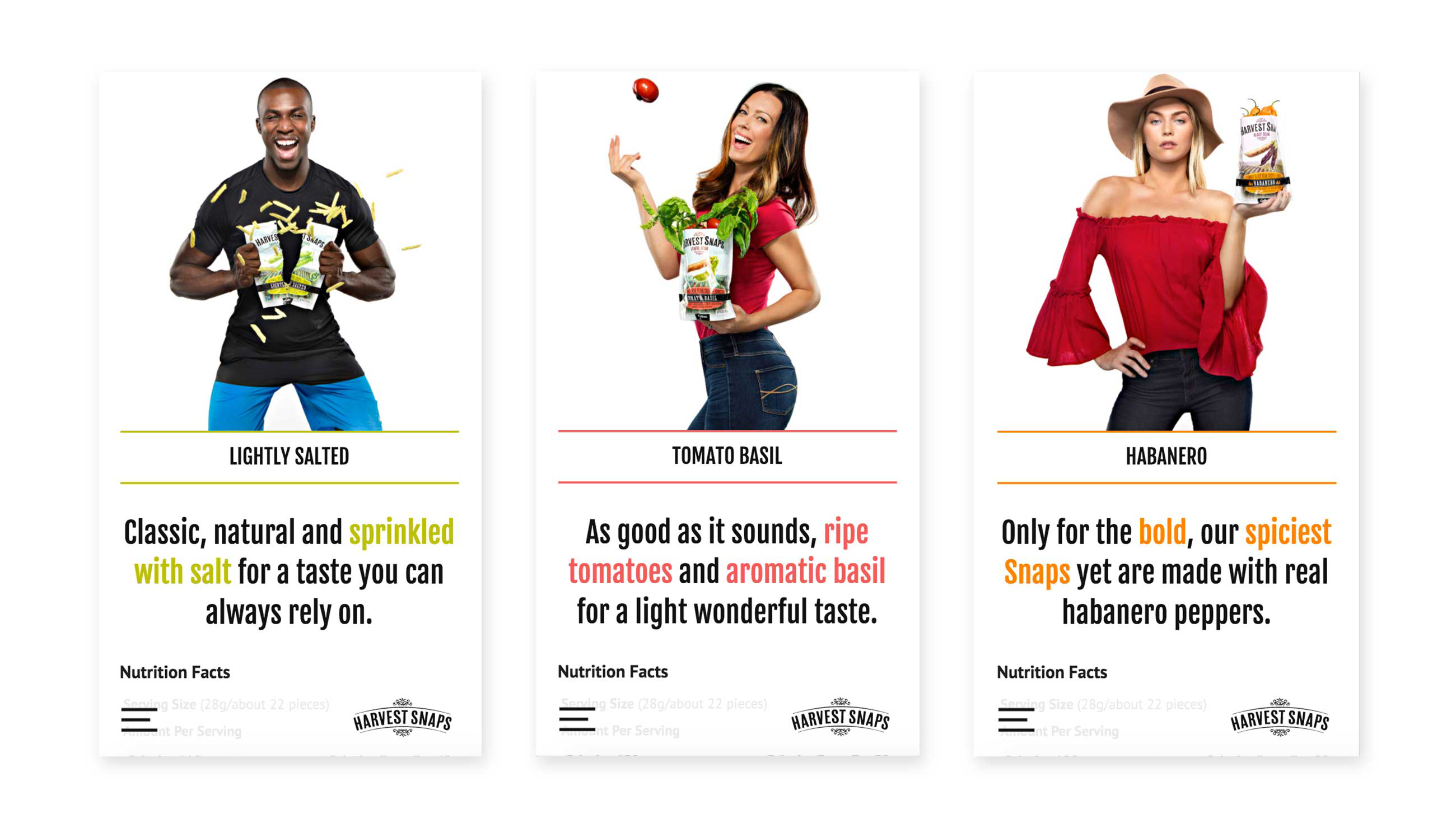
With a majority of users visiting the site from tablets and mobile devices, we overhauled the user experience by streamlining the user interface and placing a greater focus on mobile responsive functionality. With more than 82% of customers making a purchasing decision in the aisle, we gave mobile users the info they wanted, and never more than a few touches away. One of the boldest moves we made was placing the navigation fixed on the bottom of the browser, this followed best practice for the most common way people use a mobile device, one handed.
