American Heart Association
Getting people to finish what they signed up for
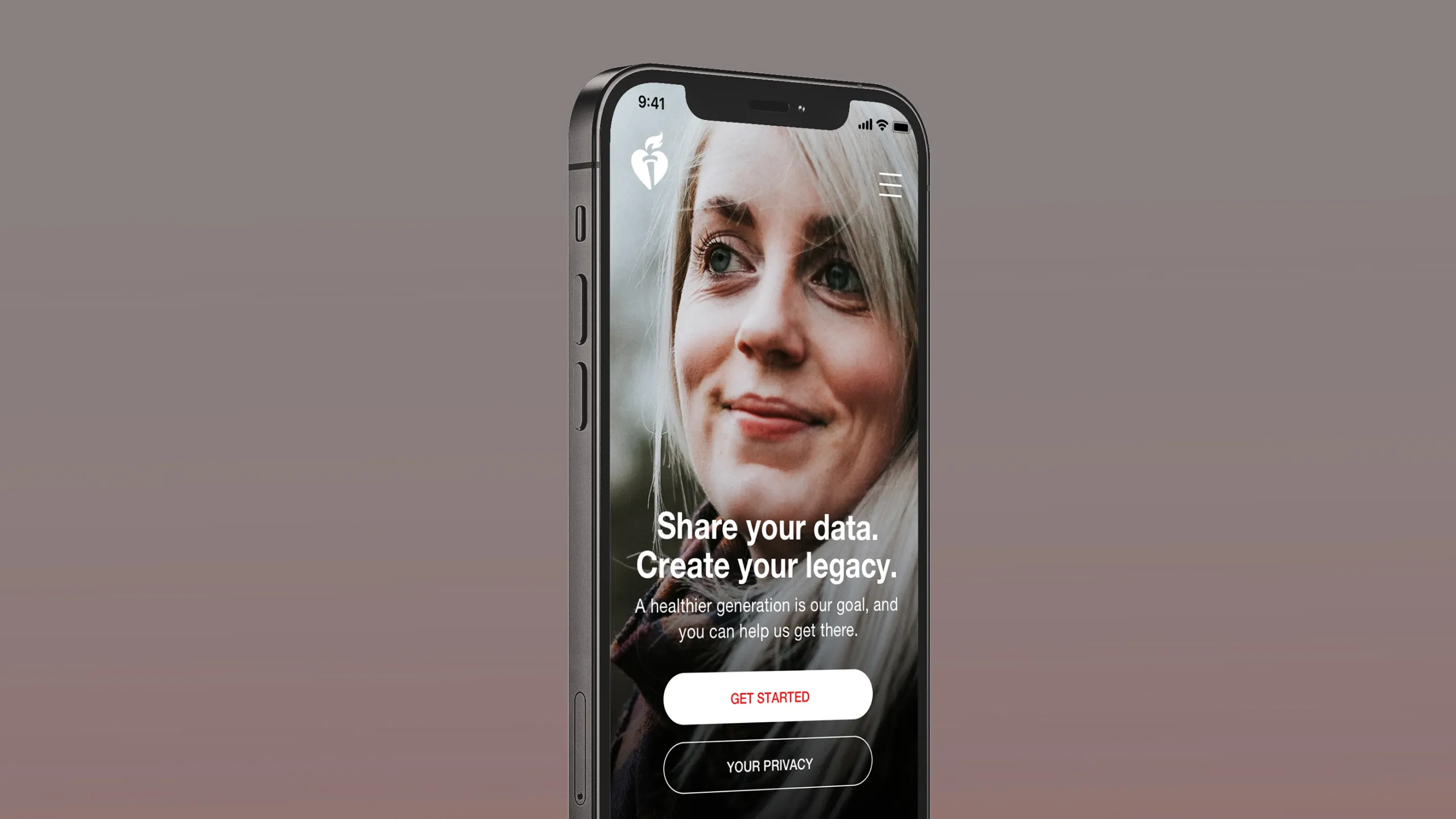

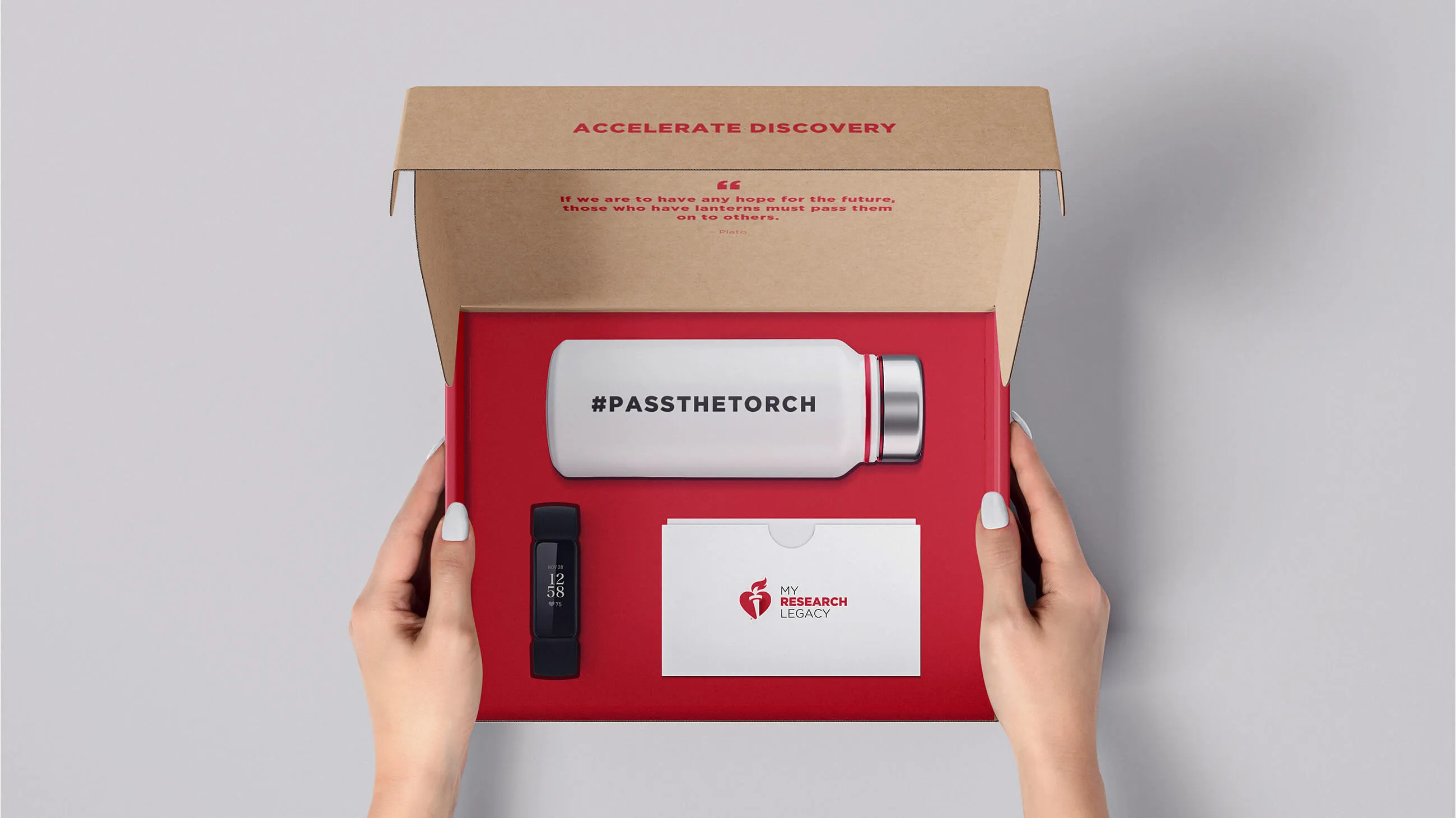
The American Heart Association knows how to run a research study. What they didn't have was a way to keep participants doing their part. People sign up meaning well, then life gets busy and the tasks sit there. We rebuilt the My Research Legacy experience around one idea: make the next thing to do impossible to miss.
- Art Direction
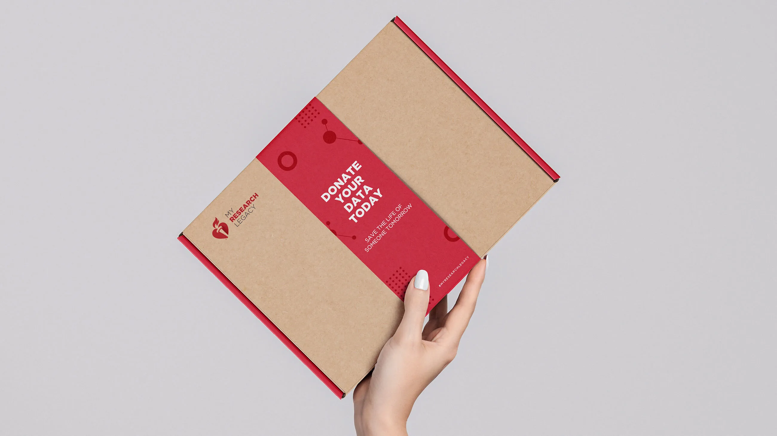
- Package Design
- UI/UX
Fewer taps means less stress
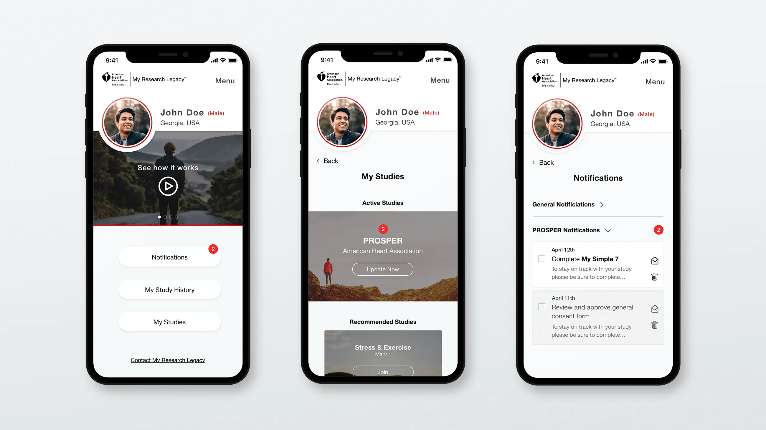
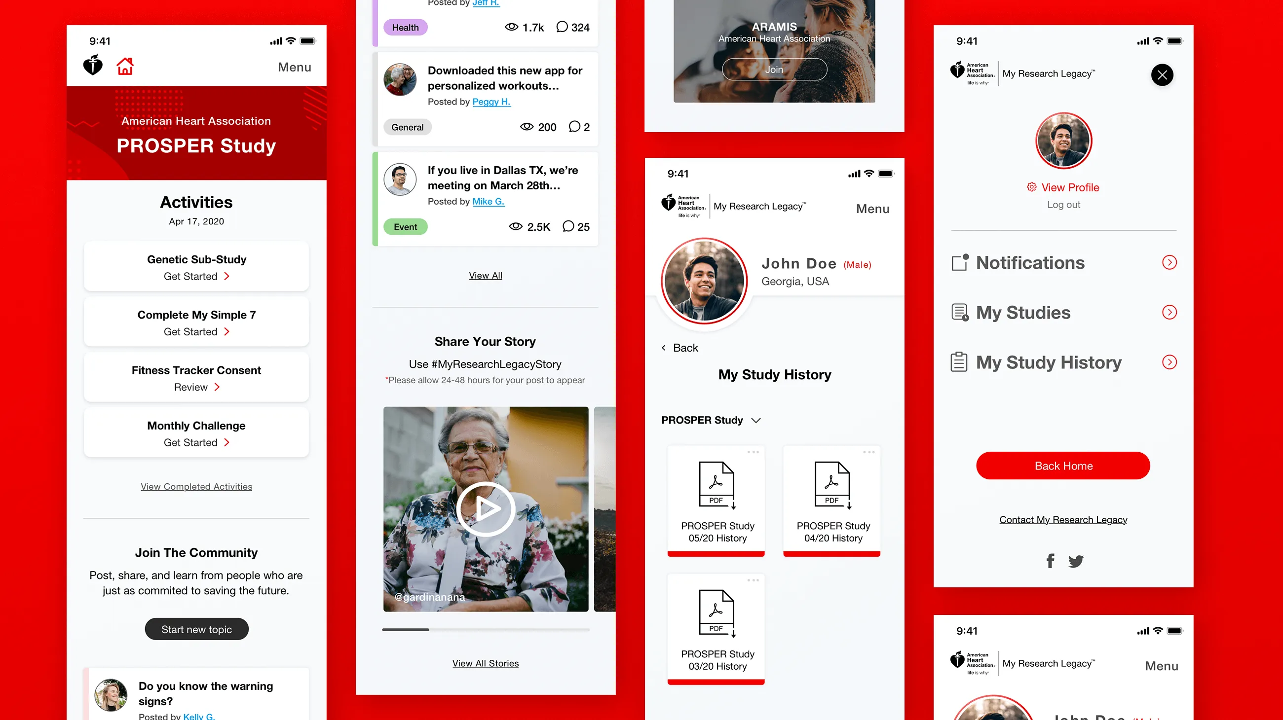
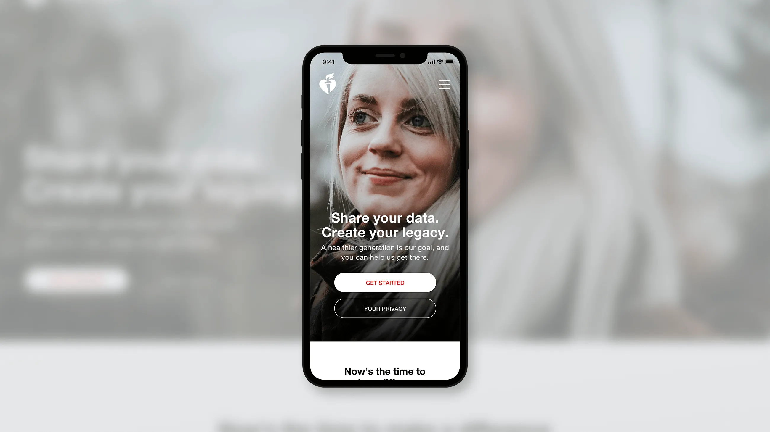
Everyone is on a phone and nobody has a spare hour. So the mobile side does one thing: it is entirely task driven. Get in, contribute, get on with your day, all inside a couple of minutes. Nothing on the screen competes with the task in front of you.
The tasks nobody could find
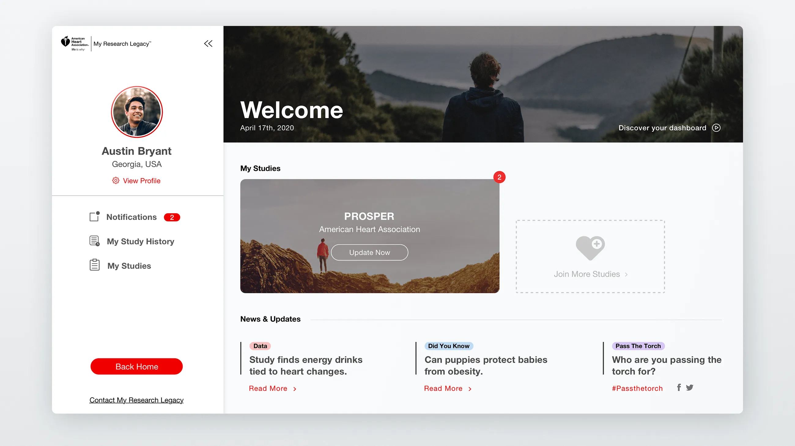

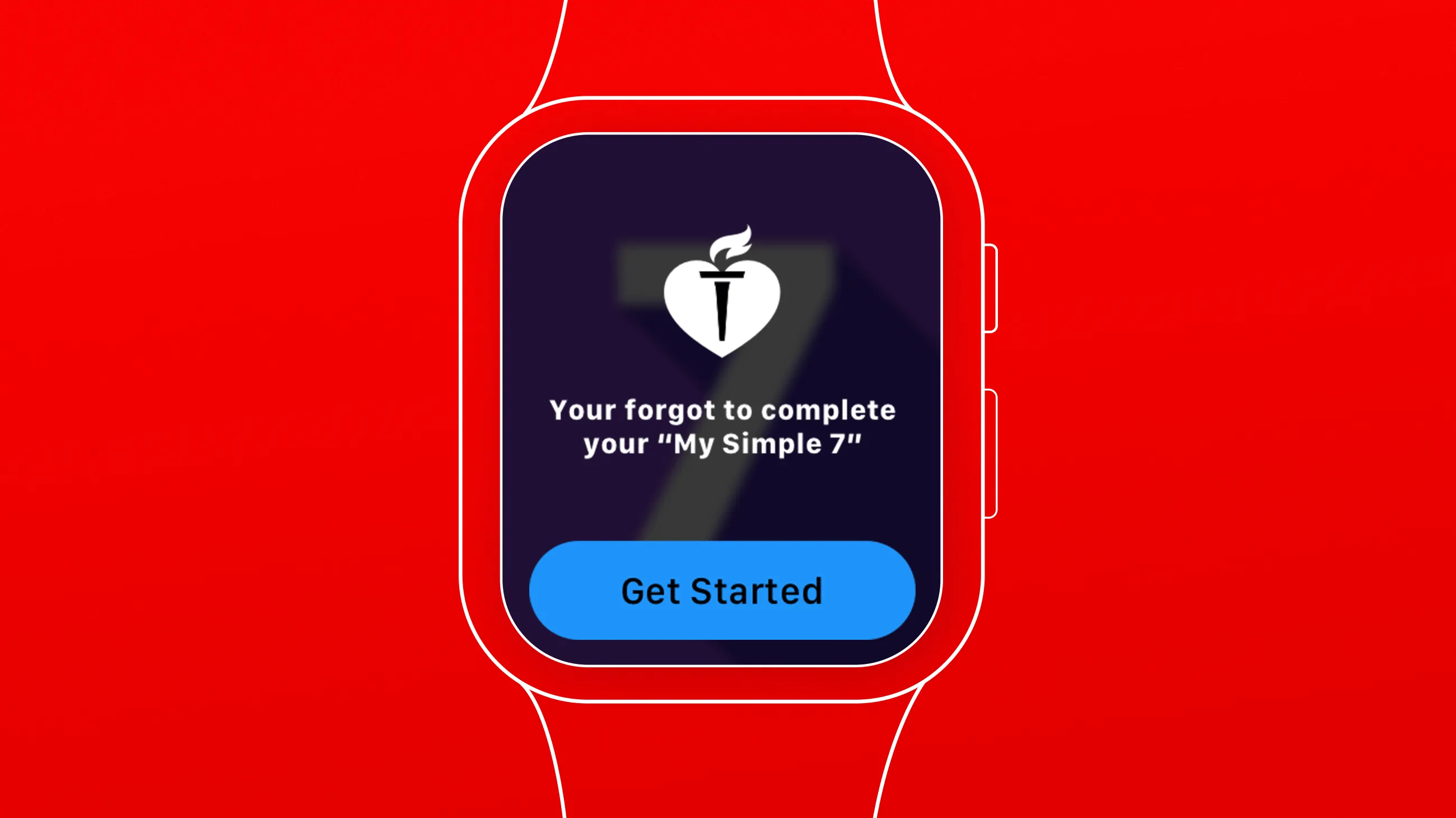
Before we started, participants were quietly failing to finish their study tasks, and the assumption was that they had lost interest. Going through the existing experience turned up something plainer. You could not tell what was still waiting for you. The fix was a notification system that pushes anything new or urgent to the front, on a dashboard built to keep an older audience oriented at every step.
This was a defined project. How that works