True Spec Golf
Refreshing golf's most premier club fitter
True Spec fits golf clubs better than almost anyone, and the brand made it look like a low budget offer. They wanted to be the name people reach for instead of the large competitor. Replacing the logo wasn't an option, so we fixed everything around it. The muddy grey dropped back to an accent next to orange, the system went black and white, and the layouts got room to breathe. Now it looks like the room you get fitted in, which was always the best argument they had.
- Brand Identity
- Creative Direction
- Art Direction
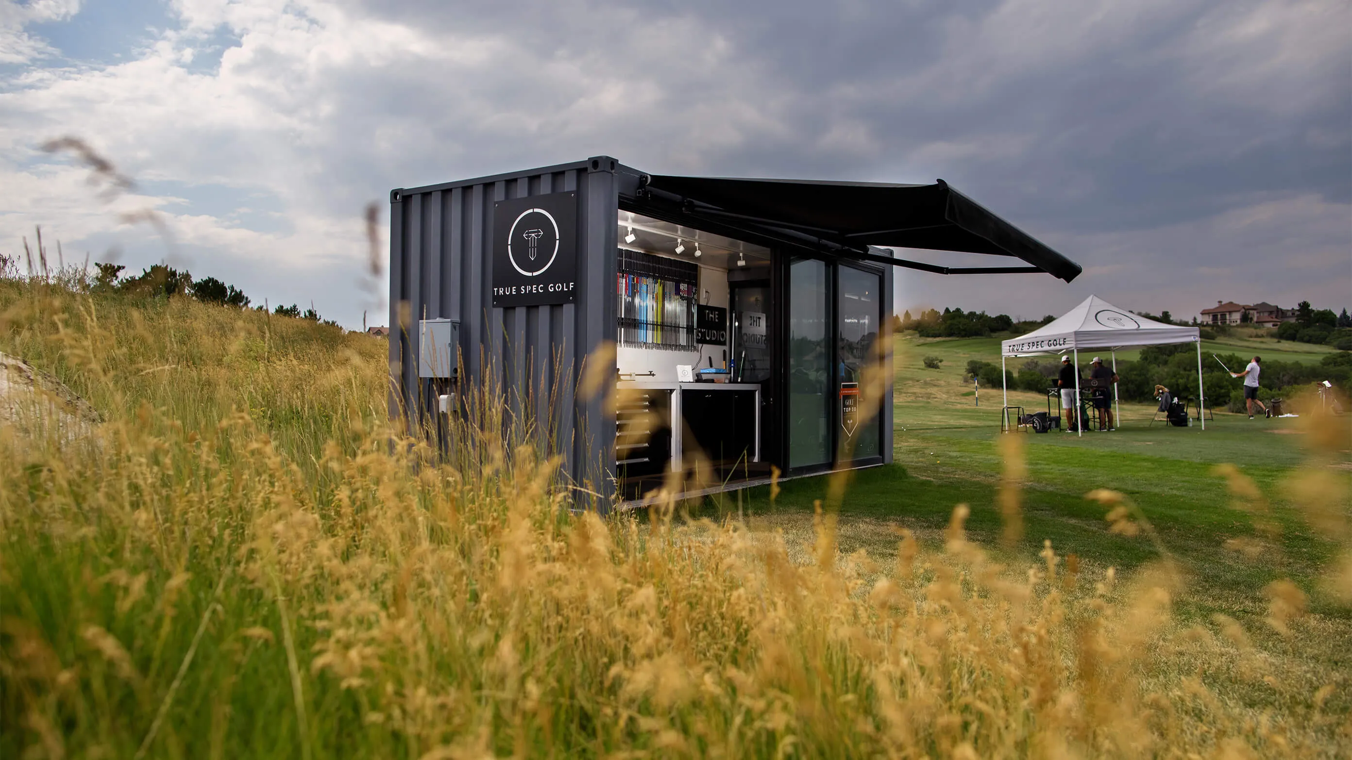
What we couldn't touch
The logo was already on signage, gear and storefronts at more than twenty locations, so replacing it would have cost more than the rest of the rebrand put together. We took out the odd diagonal fill sitting inside the T instead. That one cut did most of the work. We also built a tour version with the T scaled up against the wordmark, so it still reads when it’s on a hat on television.
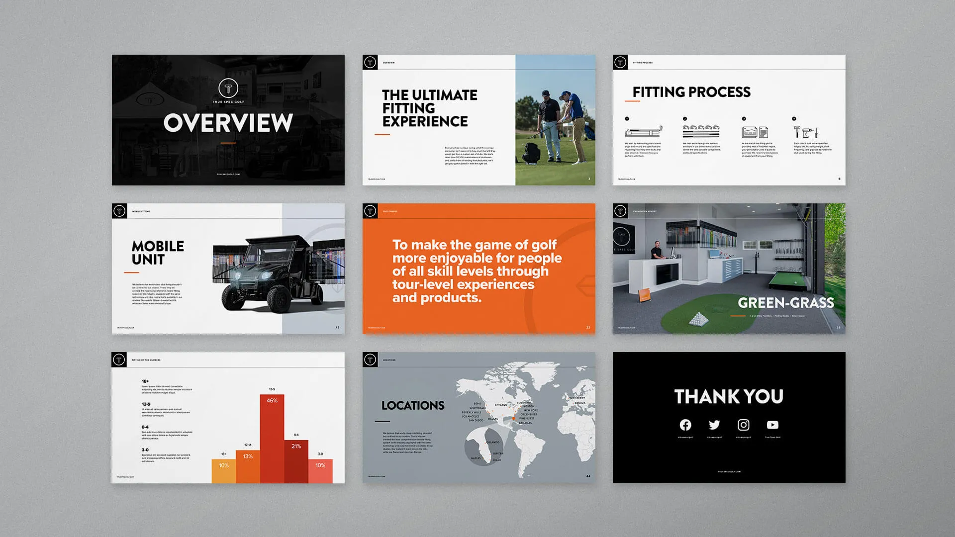
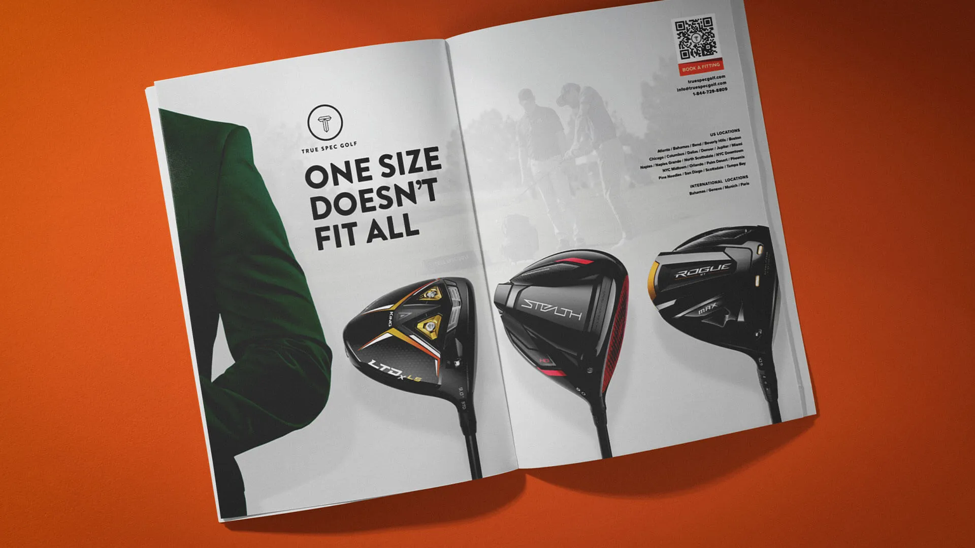
The studios were already right
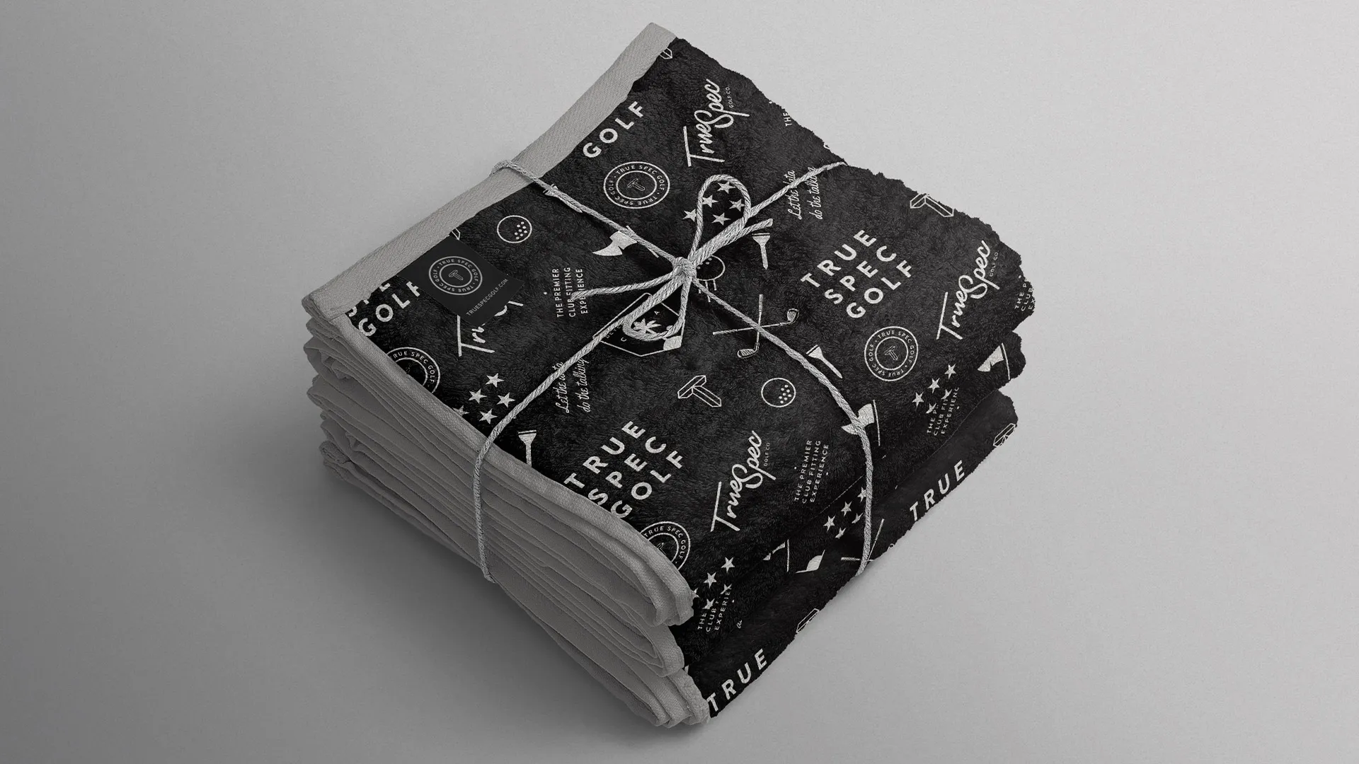
Walk into a True Spec fitting studio and it’s clean, modern, quiet. The brand didn’t match. So we built the system to look like the room: black and white, big headlines, layouts with space in them. Badges, lockups, softgoods and the coming-soon pieces all run off the same language, so twenty-plus locations read as one company.

Less to read
The site and the emails took the same instruction. Big headline, almost no body copy, and photography doing the selling. Most of those photos are the studios and the locations, because that’s what makes the price make sense. The emails picked up a second job while we were in there, pointing people toward the other things True Spec sells.
This was a defined project. How that works